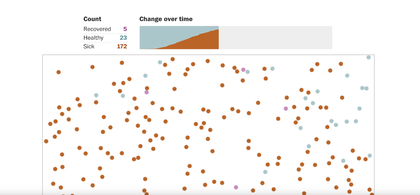
In times of uncertainty, we look wherever we can for answers. In the Age of Corona, data has been our anchor, offering insights and tea leaves.
This is data science’s Big Moment. In March, the Washington Post’s “Flatten the Curve” animation was shared widely, followed by hundreds of others. Visual Capitalist, Mapbox and Tableau (the latter two of which are also working together) have featured a wealth of COVID-related visualizations. Here at The Data Standard, we picked some of the best data moments of COVID-19 by impact and creativity — what have you seen that you like? Let us know in the comments and we’ll add them to the list!
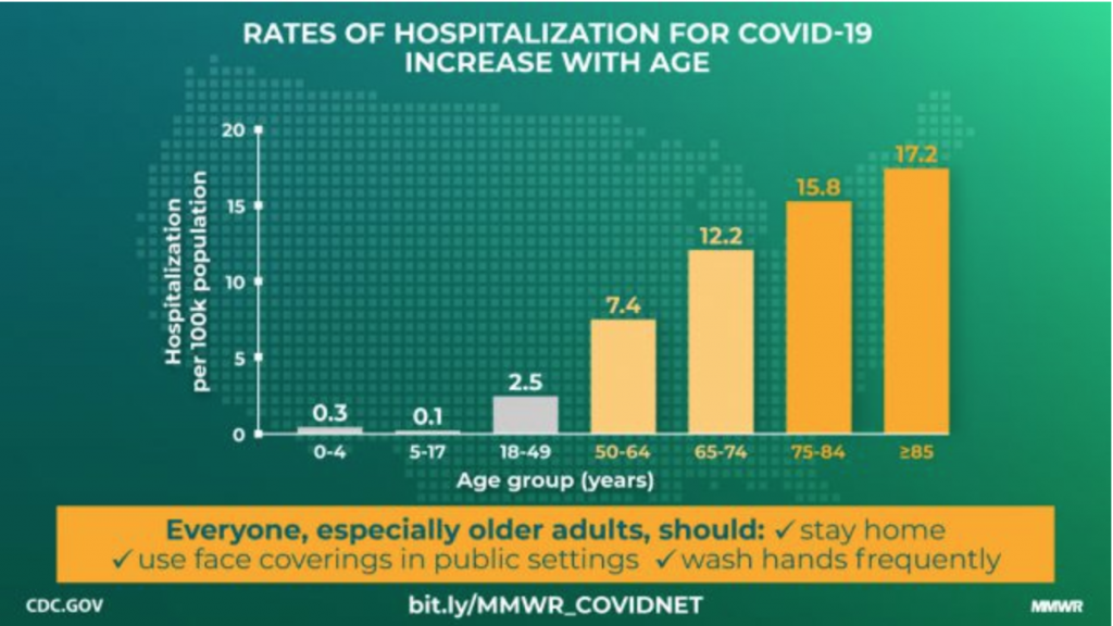
Just the Facts: Most Authoritative Source
The CDC isn’t out to win awards in design, and it shows, but that doesn’t matter since it’s ground zero for U.S. data and is simply doing its job to keep the public informed.
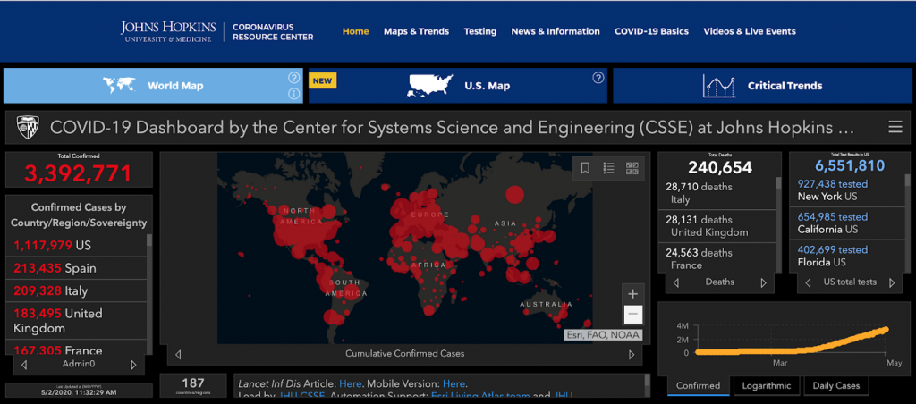
The Ultimate Dashboard: Most Reliable Source of Raw Data
Johns Hopkins has made itself an indispensable source of information for both the public and data scientists alike with a resource it hopes will “help advance the understanding of the virus, inform the public, and brief policymakers in order to guide a response, improve care, and save lives.” John Hopkins’ dashboard is one of the most comprehensive out there:
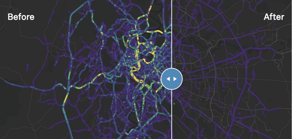
Driving Data: Best Dynamic Modeling of Traffic Patterns
Mapbox used its telemetry data for traffic volume index values to show how car, bus and truck traffic was changing through the pandemic. Mapbox offered details on the data presentation here.
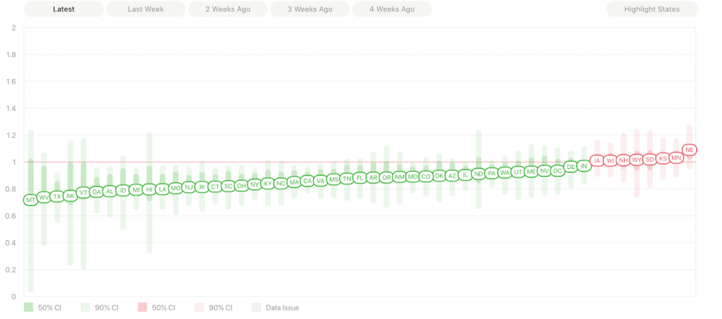
Social Power: Best Use of R
Instagram boasts 27 billion users around the globe. Its founders threw in with Rt.live to help identify community spread, featuring a very inside-baseball explanation that data scientists will love:
These are up-to-date values for Rt, a key measure of how fast the virus is growing. It’s the average number of people who become infected by an infectious person. If Rt is above 1.0, the virus will spread quickly. When Rt is below 1.0, the virus will stop spreading.
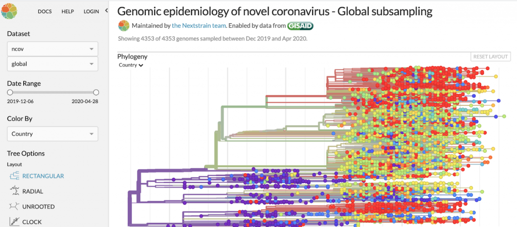
Most Epidemiological: Modeling Experience in Action
Nextstrain has been concerning itself with viruses and diseases for years. So it brings a very experienced lens on building models around COVID.
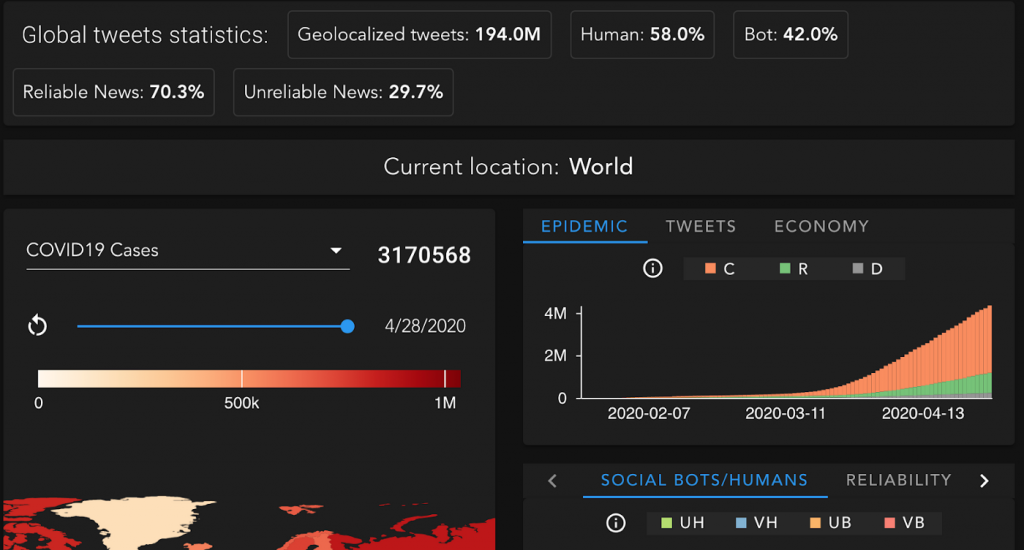
Information Impact: Best Tracking of Misinfo Spread
This pandemic entered a world enmeshed in social media, where views bounced quickly around the globe unchecked. CoMuNe lab, a unit of Bruno Kessler Foundation’s Center for Information and Communication Technologies in Italy, tracked and modeled information activity across communication tools around the world. CoMuNe tracks and analyzes tweets and other communication channels.
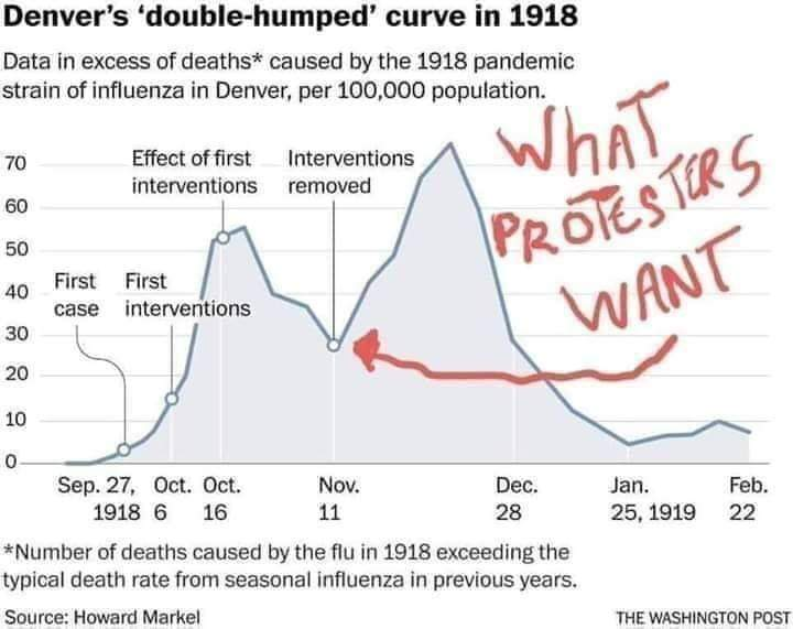
Historical Modeling: Best Look Back at the Last Pandemic — in 1918
Whether intended as political fodder or not, the Washington Post’s (yes, them again!) rendering of the U.S.’s response to the 1918 pandemic in Denver was turned into a tool for one side of a political argument.
What do you think? Let us know what we’re missing. Post your suggestions below and we’ll feature them in an amendment to the story.